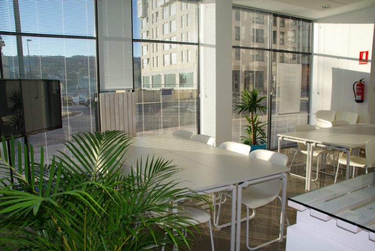
Indoor Plantscaping (part 2)
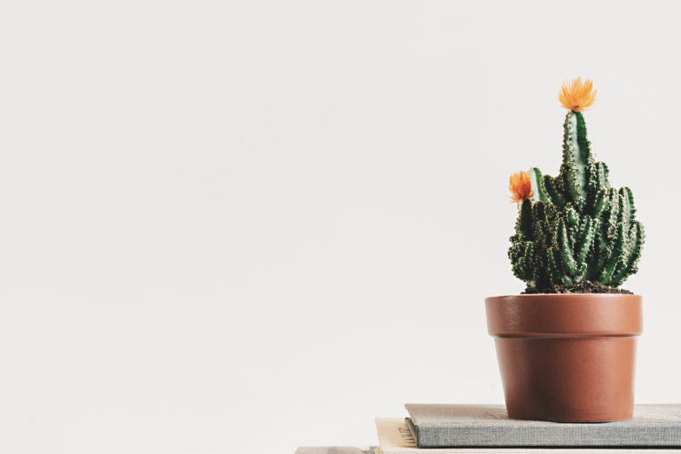
Today, we are continuing our subject of New Year’s resolution which involves the introduction of plants within the building interior. The presence of plants within building interiors could be seen as a step forward, towards what’s better. The use of plants could…