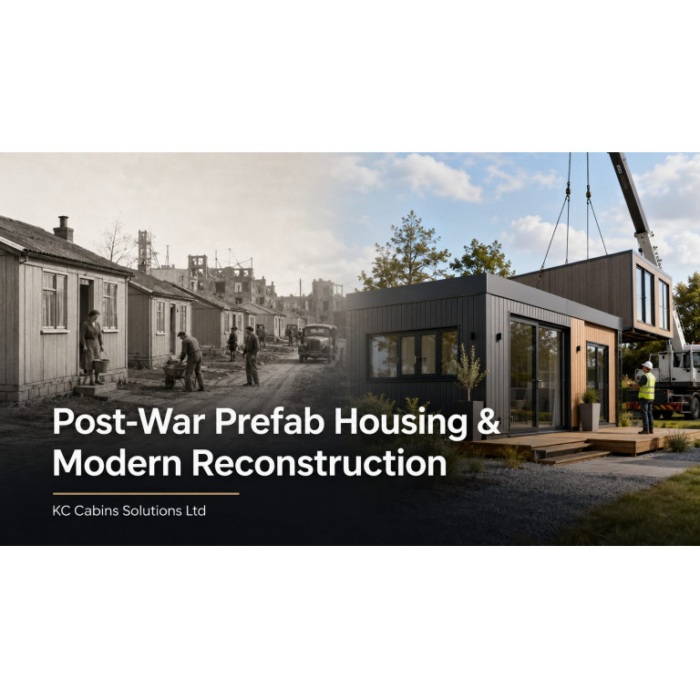
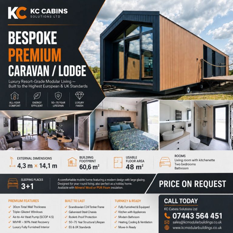
Affordable Garden Rooms UK | Design Ideas That Save Cost
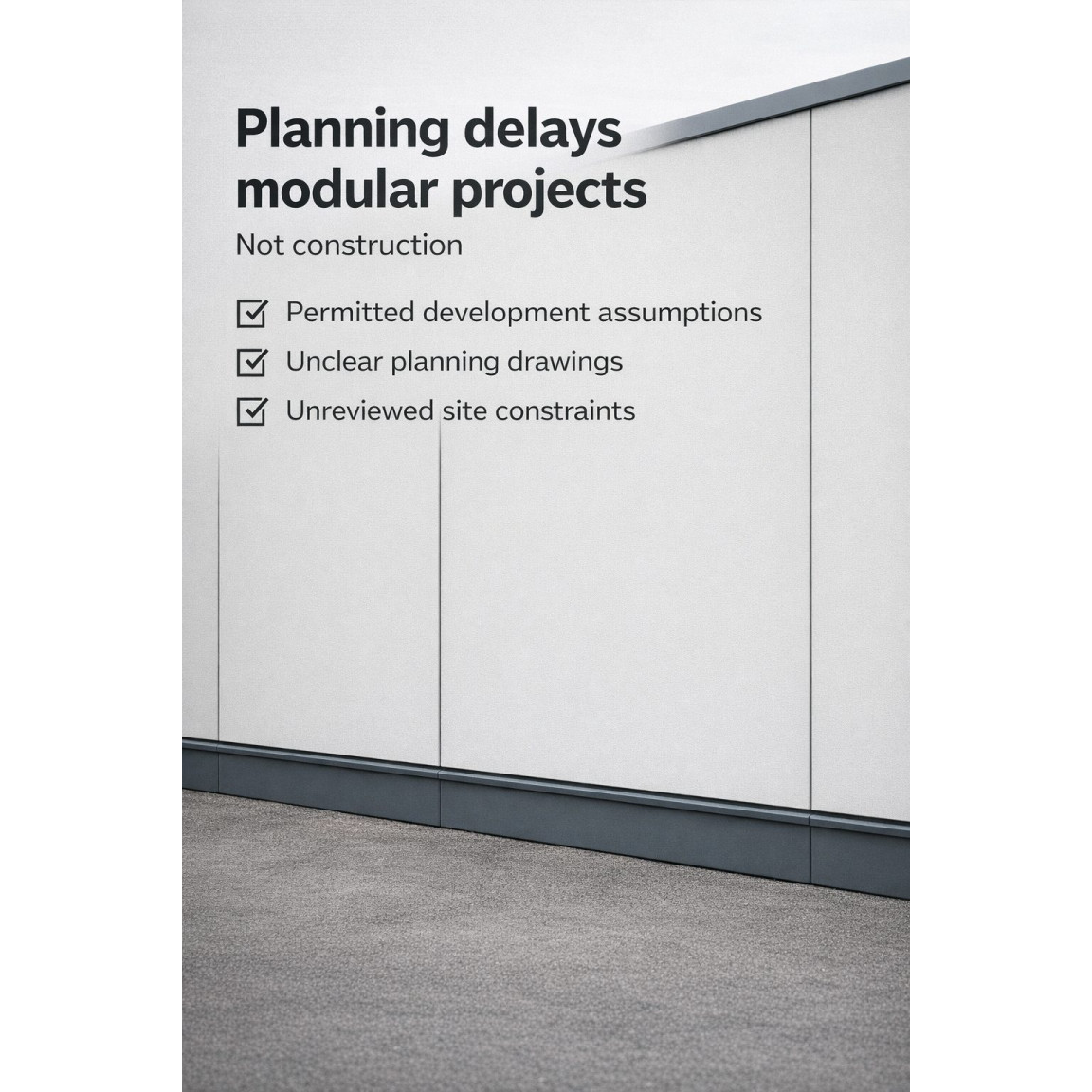
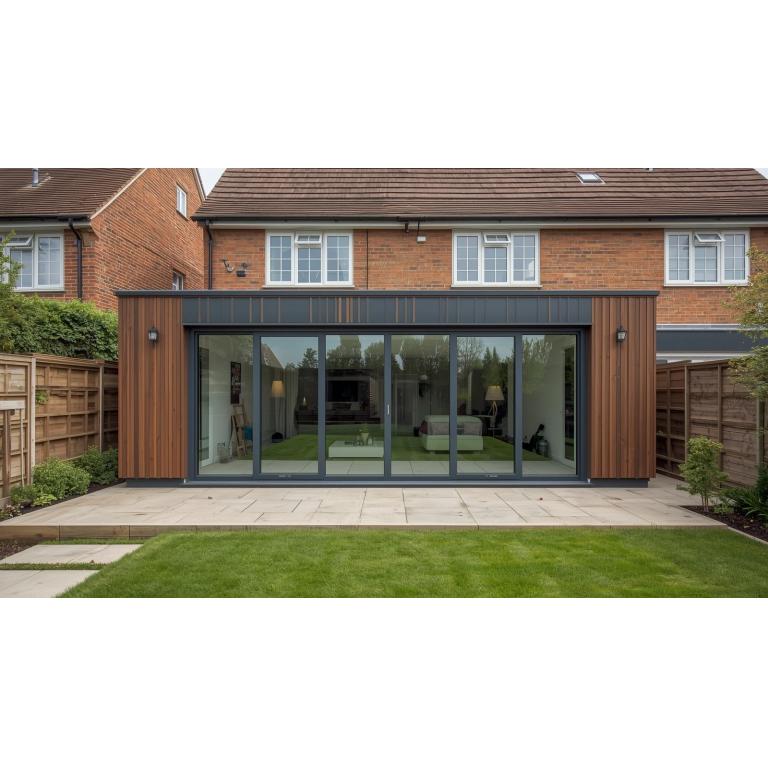
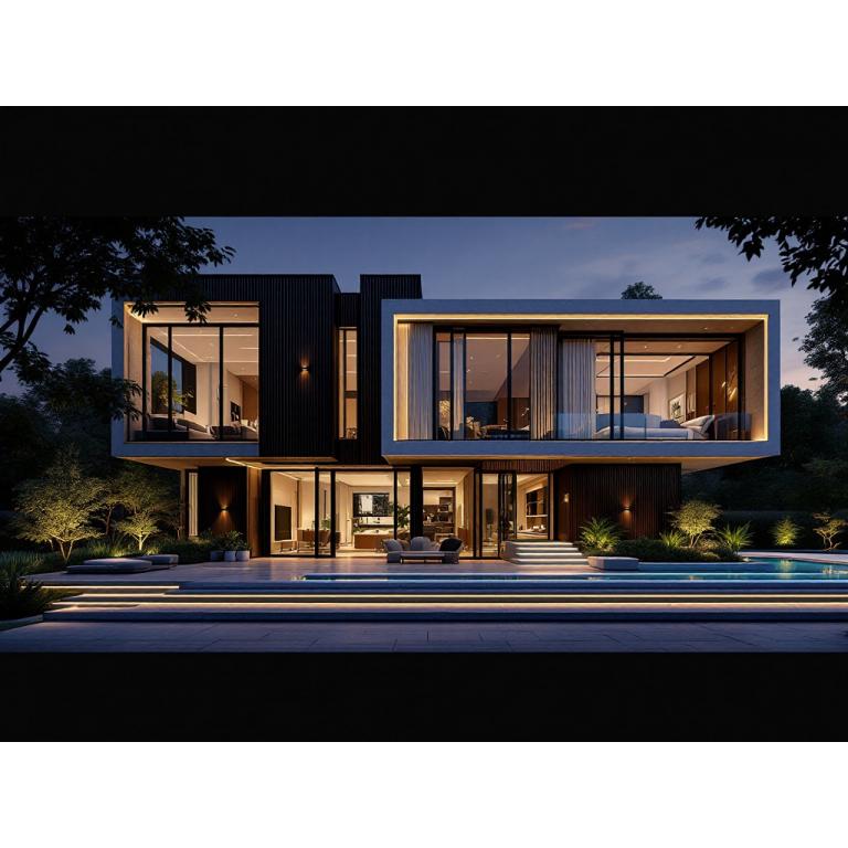
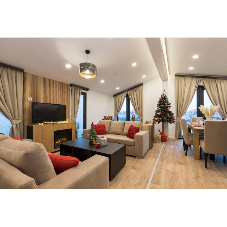
Home > Blog > Design > Affordable Garden Rooms UK Design Guide Affordable Garden Rooms UK: Design Ideas That Save Cost Without Looking Cheap A design-led guide for UK homeowners comparing affordable garden rooms, modular garden offices, studios, gyms and…