It is difficult to describe in one sentence what harmony means and how harmony is created. When thinking of harmony in design, harmony is often associated with symmetry, and yet not only symmetry creates harmony. According to a number of dictionaries, ‘harmony’ could be described as a state of peaceful existence while ‘harmony synonyms’ include ‘peace’, ‘balance’ and ‘compatibility’. In fact, those three words are some of the best to describe harmony creation. In design, through balance and through compatibility we can create peace and we can create harmony.
How do we decide on balance and compatibility though? Balance can be achieved in a number of ways; this includes the use of both symmetry and asymmetry as well as the use of light and colour. For the purpose of this article, we are looking at images focusing on composition and general shapes within.


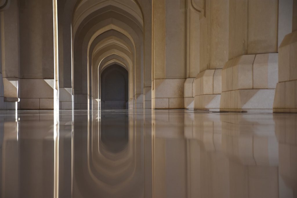
We could distinguish shapes which are balancing each other by looking at each photograph at a time. We can analyse shapes in the images by reading the photos looking at them from left to right as if we are reading a page of a book. Comparing both sides of the photograph reveal information about the composition. It reveals which shapes are being used to balance each other and to balance the composition.
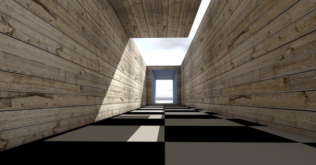
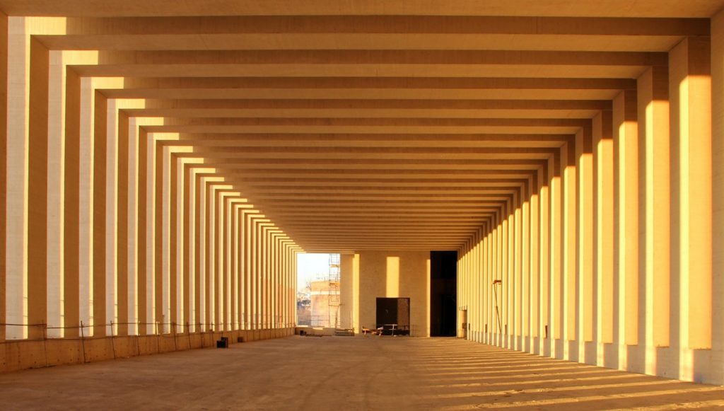
Images we see display harmonious shapes and composition. Those images evidence both symmetrical and asymmetrical elements being used in order to create harmony. What balances asymmetrical composition? What makes the elements of those compositions compatible enough to produce the feeling of peace?


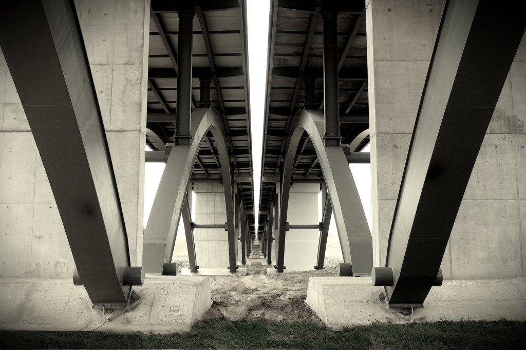
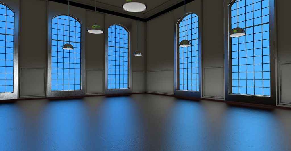
In one of the image examples at the top, we can see a heavy, bold and energic shape of a bridge balanced by a vague, continuous, horizontal line of this same bridge disappearing in the distance. In other images, we see mainly one bold symmetrical shape combined with asymmetrical elements such as clouds or building reflections. Light reflections enhance the softness of the image and therefore add to the harmonious composition. Soft light and soft colours are used to create a feeling of peace.
Overall, we see images balanced with shapes, colours and light within.
Balance and compatibility are crucial in order to create peaceful images. With the right use of composition elements enhanced by the right colours and light, we will achieve harmony in the design. In order to find out how to do it, we look around and learn from what we see.